Chanel No. 5 demonstrates how minimalism may result in a very recognizable identity. Launched in 1921, the fragrance was named with a simple numerical name (No. 5) instead of an elaborate name. Additionally, the rectangular glass bottle was simpler than the ornate perfume bottles that were common during that era. The clean design included a white label with black letters and a geometric shape.
Most importantly to me is how little the design has to convey luxury. The bottle does not require intricate decorations to convey luxury. Instead, the design of the bottle allows for the importance of both the fragrance name and fragrance to take precedence. The minimalist approach is also in line with the overall aesthetic of Chanel. For Chanel, elegance is often conveyed through eliminating extraneous details.
This lesson may be particularly relevant in visual communications because designers may assume that more details make something more intriguing. However, Chanel No. 5 demonstrates the contrary. Using only a few recognizable visual elements results in an easily recognizable identity.
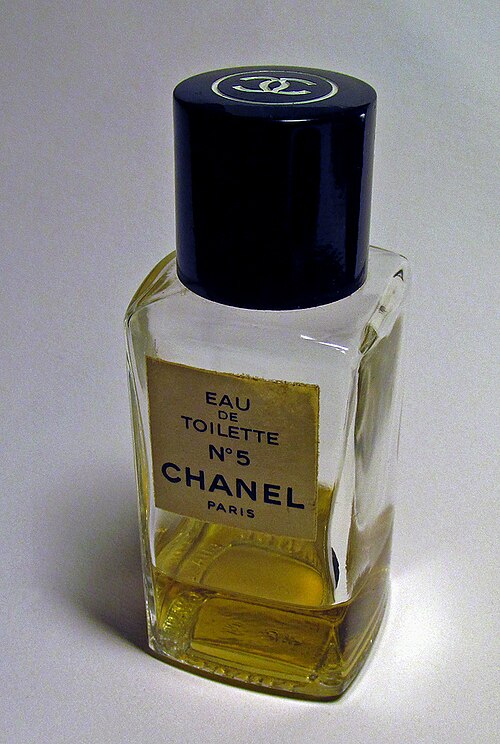
Credit for Image: Photo from https://commons.wikimedia.org/wiki/File%3ACHANEL_N%C2%B05.jpg?
Multimedia: https://www.youtube.com/watch?v=0hcaaKhGL00


Leave a Reply