Citroën’s double-chevron logo represents one of the simplest examples of visual identity derived from a company’s past. Prior to becoming involved in manufacturing automobiles, André Citroën became interested in a gear system utilizing chevron-shaped teeth. As stated above, the double-chevron would later evolve into the icon that came to be identified with the Citroën automobile company.
Why I prefer this logo is that although the symbolism is simple in terms of appearance, the technical background of the symbol provides a great deal of substance. One does not necessarily need to know anything about engineering to recognize two shapes. Since then, Citroën has changed its logo multiple times, and although it has done so, it still refers back to its beginnings and how the company originally produced innovative goods.
From an advertising perspective, maintaining consistency is essential. Many companies revise their brand identity frequently. Losing recognizable aspects of their visual identity weakens brand recognition significantly. Citroën offers evidence of how companies can develop new identity systems while maintaining an element that refers back to their historic significance and technological innovations.
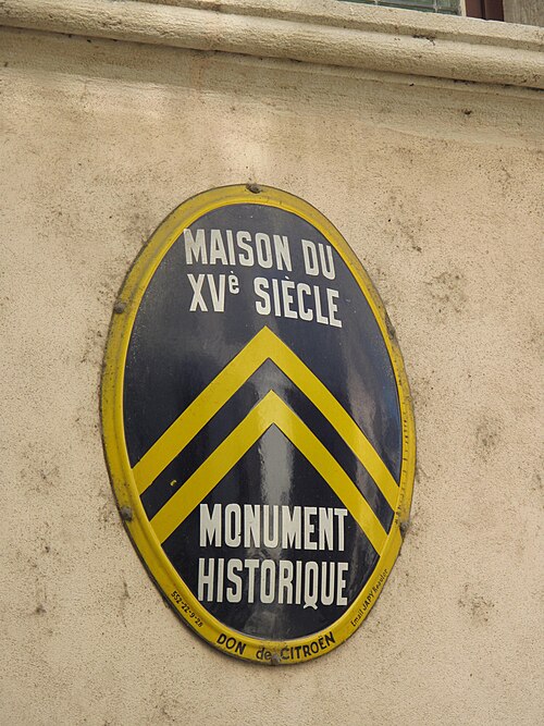
Credit for Image: Photo from https://commons.wikimedia.org/wiki/File%3AFormer_Citroen_logo.jpg?
Multimedia: https://www.citroen.com/en


Leave a Reply